Reading the results
The charts are built to be interacted with and provide more detail the more you look at them. However, they are also intimidating to look at for the first time. This page will help you understand what you are looking at and how to interpret the results.
Using the charts:
Below is the results dashboard which contains the main results of the model and incidentally, some of the assumptions.
- Notice how you can click on categories in the legend, and also double click to isolate a category. You can also click and drag to zoom in on a section of the chart, and click and drag the axis' to change the scale.
- You can also hover over the chart to see the values of the data points. If you are confused about any of the information or cateogories you can read about them in the glossary or the methodology.
This dashboard is for the Target scenario which is more optimistic.
What should I focus on?
The most important things to look at are the total energy use and emissions. However, information on stocks and activity is also important for understanding the speed of the transition, especially when viewing the sales/stock shares and how that translates into energy use, given the changes in activity.
This dashboard is for the Reference scenario which is similar to a business as usual scenario.
You can also see the historical data in the chart below. This is in the results dashboard and is useful for understanding the trends in the data and how the model is projecting the future compared to that.
What ARE the assumptions?
At the end of the day the majority of these charts don't actually show the assumptions but instead, very specifc results which directly communicate the assumptions. For example the vehicle sales shares charts on both the results and assumptions dashboards take in a few assumptions for sale shares at different points in time, intepolate them and then run them through the model to calculate stock shares (dotted line). However the interpolation step and then calculation of stock shares (which involves assumptions about turnover rates, vehicle age, activity growth and so on) processes the sales share assumptions so much that these graphs have become detail heavy results in and of themselves.
You can also see my 'extra assumptions' dashboard below, which is something I personally use to check everything in the model is working as expected:
What kind of projections are these?
At the end of the day energy modelling projections are quite uncertain and based on some degree of subjective opinion. This is because they rely on a lot of assumptions about the future. This is generally why we call them projections, not forecasts.
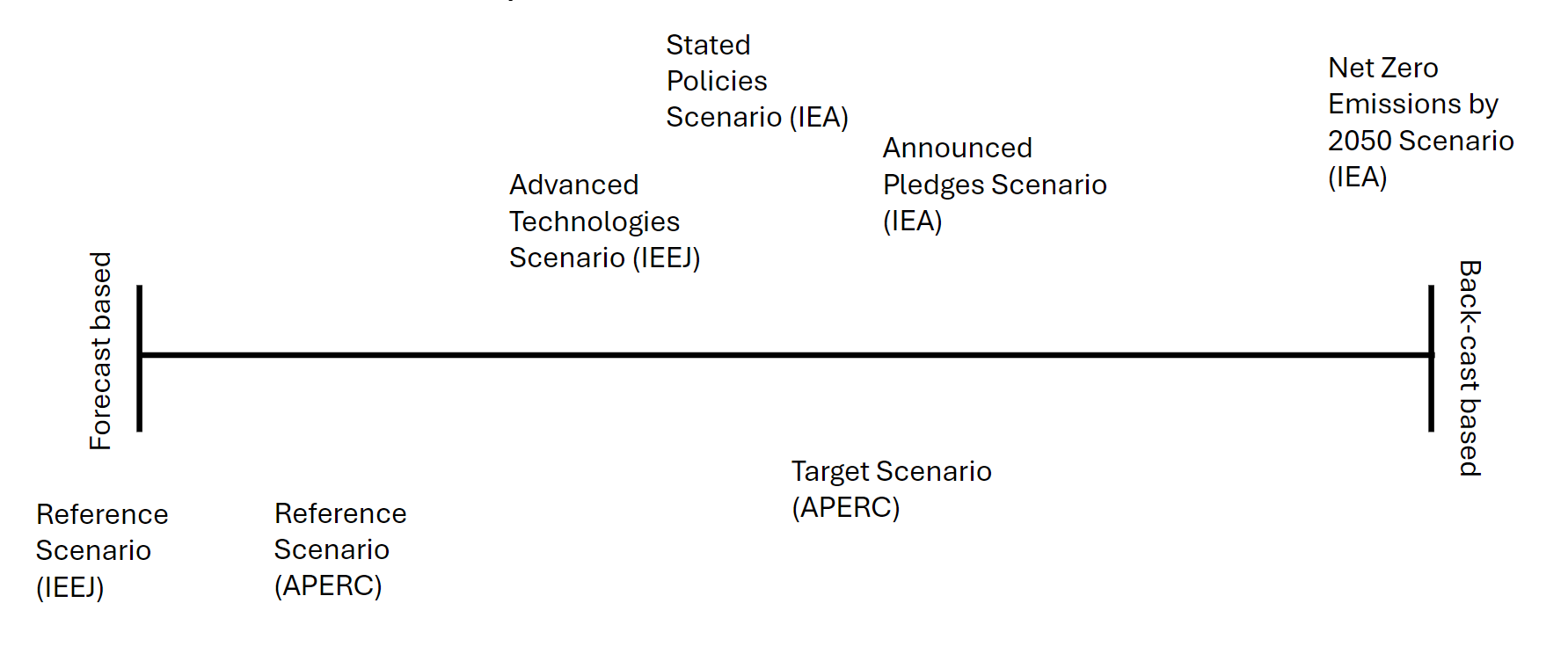
Sometimes it's best to think about the projection/forecast dichotomy on a spectrum. On one end you have projections, which are generally backcasts based on what might happen if we achieve certain goals - they are not meant to be accurate, just helpful for imagining the effects of achieving these goals. On the other end you have forecasts, which are generally based on what will happen if nothing changes and attempts to predict the future more accurately (however almost all 'forecasts' should be treated as inaccurate. Like backcasts, they are mostly suited to encouraging the reader to better imagine what might happen). Then in the middle you might have scenarios based on what might happen if some things change, such as technology advancements or policy changes. See below a spectrum we quickly created for a presentation:

Generally you can also think about it like this: At one end you have the 'business as usual' forecasted scenarios which is an attempt to forecast what will happen if nothing changes. At the other end you have the 'optimistic' scenario which is a projection of what will happen if everything goes right (we reach our emissions targets, say). In the middle you have the 'current policies' scenarios and 'technology advancement' scenarios which are projection of what will happen if some things change or we take the most optimistic current trajectories.
All in all, this is a really subjective thing and what I've described is just the way I see it. And then when you look at a complete energy outlook, which are a combination of different energy models, produced by different modellers with different perspectives and ideas on what the scenarios are... it all flies out the window. I think then, the best way to think about it is:
What is the intention of the scenario, the modeller and the organisation?